Showing posts with label Designer Analysis. Show all posts

Monday, 3 January 2011

Designer Analysis - Sgro, Donna & Teijin

Sgro, Donna

Donna Sgro is a young designer working in Australia controling her own independent, boutique womenswear label called Donna Sgro. Her achievements include: (as part of the 1st Shinmai Creator’s Project) showcasing at Japan Fashion Week in Tokyo in 2009, exhibiting in Paris and is now part of Trash Fashion at the London Science Museum. Sgro's work is interesting because of her own interests, textiles place side by side with the latest technologies and production methods with playful colour combinations.


Sgro, Donna & Teijin
Trick of the light
Donna Sgro has designed the dress, titled trick of the light (shown above,) with a 1940's retro style ( an example shown to the right on the cover of a 1940's dress pattern.) The features include: a tailored cut; high wasted design pleated as if contained by a belt; a round neck created by two shown and emphasised pattern pieces; buttoned from top to bottom down the front seam; sleeveless arms, but with small ruffled cuffs on the shoulders; a respectable length sitting just over the knee; all neatly finished. The style has a modern womanly feel revolutionised by a post-war society where woman were now regarded as more independent, sophisticated and ready to work.

The dress material and style has no pattern motifs or accessories allowing focus to fall on the unique qualities of the material itself. A unique surface which can be described as the following: modern, reflective, heavy, shimmery, new. From afar the colour would resemble a grey but with the technology involved with it's production and the finish it gives grey as a description is far from the truth of the attractive aesthetic.


Inspiration to design the textile was in the question: How does a peacock’s feather or a butterfly’s wing create vivid displays of iridescent colour? The answer to both creatures is without dyes.


The textile industry is one of the most chemically intensive industries on earth, and is the No. 1 polluter of clean water (after agriculture). The problem is the amount of clean water needed in the production processes for example it takes about 500 gallons of water to produce enough fabric to cover one sofa. This water then pollutes as it leaves the majority of factories because of the effluent’s heat or the increased pH as well as this the water becomes full of chemical saturated with dyes, de-foamers, bleaches, detergents, optical brighteners, equalizers
additives to name a few, all of which help damage the environment. The developments in science that offer opportunities to produce colour without dyes could effectively have a major positive impact in the environment. As well as this the new material unlike your dyed clothes this colour won’t fade providing a higher quality more durable product, traits desirable in sustainable products.

This shimmering dress is made from a material called Morphotex, produced by the Japanese textiles company Teijin. An overview of the concept can be described as a material that mimics creations in nature by using just a trick of the light rather than an added dye. More specifically nanotechnology is used to create an iridescent effect – known as ‘structural colour’. The vibrant blue of the morpho butterfly is made into a template as the microscopic structure of its wings was recorded. Teijin uses 61 ultra-thin alternating layers of polyester and nylon to create each Morphotex fibre. By making each layer a precise thickness between 70 and 100 nanometres it’s possible to control the way light bounces, bends and scatters inside the fabric. This creates four basic colours (red, green, blue and violet) that reveal a rainbow of shades as light plays off the fabric.

Apart from Morphex there is a whole stream of technologies developing from natural designs with the same ideas of developments in mind including a team at Cambridge University who have recreated the bright flickering colour of opal gemstones, explained by Snoswell:
‘Previous man-made opals have been delicate and brittle. We’ve replaced the perfectly stacked glass spheres in opal’s structure with tiny plastic ones to create a new “copycat” opal that’s really durable and elastic. It opens up exciting possibilities to create new effects in fabrics.' David Snoswell, a nano-colour expert at Cambridge University.

Withing the Trash Fashion exhibition the descriptive comments summarise by talking about the technologies future: " There is huge potential to produce clothes by using this colour-changing material. In the next few years it could give an entirely fresh look to clothing " Science Museum

"... It’s possible to create subtle highlights, but we could also see swimsuits that make the wearer look like a tropical fish!"' David Snoswell

The summary specialises on a specific couture idea of a swimsuit. I think this prediction is ideal for the technology as finding the resources and capital to produce textiles at a Nano sized level for a mass market, I believe, would be near impossible but the fact companies are investing into sustainable ideas is progressive and even more so that designers like Donna Sgro are getting to use the materials in there designs, raising awareness and providing a muse to young emerging designers or fashion enthusiasts.

Summary of the Product:

Advantages:


Economical:
  • The new material would provide a dramatic selling point to boost the sales of a garment.

  • No dye manufacturing costs.

  • Reduced pollution costs (clean up etc)

Environmental:


  • Having no dyes reduces the pollution caused by production.

Ethical:


  • Aesthetically pleasing to an extent

Disadvantages:

Economical

  • Higher price to produce the material, including materials, labour ect

  • Material may be limited during other processes

  • Combination of materials may make it difficult to recycle

  • The fact the material is a new technology may either reduce or produce clients this can not be decided until it has integrated fully into the market

Environmental


  • Only cuts out one environmental problem, still many to face.

  • Heavy manufacturing process of the material may cause other environmental damages.

Ethical


  • High prices will limit and select the target market

Designer Analysis - Goldsworthy, kate

Goldsworthy, Kate

Kate Goldsworthy is a British textile designer and researcher working withing the TED research cluster based at Chelsea Collage of Art , passionate about sustainability and moving the fashion and textile industry forward, developing with ecology in mind. So far Kate has made an impression by developing the recycling and reuse of polyesters, young in her career, it is predicted that Goldsworthy and her predecessors will create a dramatic influence in the world of design.
As a textile artist she would be considered a modern entry into the movement of Environmental art, which deprived in the late 1960s as awareness of human destruction to the planet became more spread. The art can be considered in two different contexts relating to ecological issues or the natural, both involve addressing social and political even historical issues. However Kate has taken a more productive approach with her artistic abilities and is working as an active designer, with the philosophy of designing bjects and services to comply with principles of economic, social and ecological sustainability.
The intention of sustainable design is to work skillfully and sentitively towards eliminating negative environmental imact. It is a growing theme amunst designers, a reaction to the global environmental crises, rapid population growth and activity, depletion of natural resources, damage to ecosystems and loss of biodiversity. Ideals of Sustainable design include:
use of re-newable enegy sources, low energy material, non-toxic, recycled, sustainably prodced materials, efficient energy manufacturing processes, low energy requirments for products, high quality, durable, designed with a second life concept in mind, designed with a recycling pathway in mind, Low carban footprint.

The most innitive way of achieving sustainable design is upcycling, creating new products from old waste, designing with a second life inmind. The concept believes that one person's waste (e.g.industry bi-products) can be anothers fuel, it just requires the right design processes and technology. This will reduce the amount of waste going into landfil and the demand for raw materials, or even effectivly use new sustainable materials and production techniques.

Goldsworthy focus is based on the concept of life-cycle design or upcycling, she values design aestetics as well as fuctional uses of synthetics materials, designing with monomaterials suitable for upcycling.

Hot look
Goldsworthy, Kate
with thanks to: Textiles Environment Design,Chelsea Collage of Art & Design;Teijin Fibers; TWI Ltd and The Materials KTN

The dress is a simple elegant cut which draws to the focus of it's pattern. Traditional ornament flowers traditionally seen on 19th century wallpaper designs. The dress is entirely black except for a lilac blue sleeveless overlay cropped above the mid drift.
The pattern is created through cuts Rather then colour producing an interesting surface that is unique to the industry. These cuts as described are produced , more specifically, by laser beams used to slice, almost ‘stitch’ and pattern this intricate shift dress. The Lazor technology is called ClearWeld, and was developed at The Welding Institute in Cambridge. The process is explained: ‘Firstly, a programmed robotic arm applies an “absorber” liquid to the fabric to outline the pattern ... Then a low-energy laser beam travels over the material – it leaves some areas unaffected, but the sprayed areas melt because they absorb more laser energy.’ Ian Jones
A limited technique in terms of pattern design in comparison to current processing in the fashion industry however for Goldsworthy it's limitations are being extended as she works on new and exciting ways to push it's boundaries.
The only material used is 100% recycled polyester. This is the key factor in relation to it's value as a sustainable design. Having used only the single recycled materials the design firstly removes what was considered waste from landfills. a second factor is that when the product is at the end of it's life it pure and thus potential easily recycled again. The processes is working towards a closed loop concept and an example of upcycling.
Traditionally all clothing materials were made locally, naturally from animal and plant sources, when there life cycle was over they would decompose and naturally be recycled through the seasons . Now however thousands of materials are used from both natural and synthetic sources, normally a combination of the both, to achieve the demands from our ever growing population. The hybrids and our lack of understanding, or technology to separate, means now most of the materials end up in landfill, or any recycled materials produced are a monstrous and have few properties desired to fulfill a second life cycle. Human demands are so high that they can not be met if society took a step backwards to using traditional techniques and only natural resources.
Polyester clothing is made out of oil, a non-renewable resource that is running out. Like most plastics, polyester is difficult to dispose of because it takes so long to break down. This is seen as a disadvantage as most designs using polyester have a short lifeline with no upcycling future, the resource then gets wasted, its thrown into landfill polluting and occupying valuable space. However if we isolated the valuable non-renewable resources and designed products with second life cycles then the description can be seen as a advantage providing durability and quality.
The pure material is easy to recycle, Goldsworthy has teamed up with Japanese textiles company Teijin. They have developed a new chemical recycling process for polyester fibre to make it good as new. This means polyester could become infinitely recyclable, opening up exciting possibilities for the future of manufacturing. The technical advancement closes the life cycle of the dress and is a key factor in it's credibility.
Rather then a traditional step back it is the step forward to use synthetic materials in a closed loop system that needs to be initialised. Goldsworthy is one of the few examples that is providing a stepping stone to this new industrial revolution.
The next step would be then to integrate this type of technology amongst the existing manufacturers. Goldsworth describes this process as a responsibility for both manufacturers and designers:
'Yes, large companies need to figure out how to collect and sort old, unwanted clothes to reuse or recycle. But at the moment it’s very, very hard because so many different material types are all mixed together. So it comes back to designers – we really need to think ahead and design clothes that are easy to recycle.’ ... ‘Designers have an important role to play to make clothes fully recyclable in the future,’
Goldsworthy
The dress was showcased within the Science museums exhibition Trash Fashion and the notes they conclude with discuss the products future:
'The future is local... large companies could operate local hubs where people bring their old clothes to be chemically recycled into fresh polyester fibres. New digital manufacturing methods would enable new clothes to be made individually and on demand at the same site, which would massively reduce material waste and transportation costs.' Science museum
The talk of big companies almost diving to cater locally seems like an idealistic utopia idea a unrealistic summary,which I personally think could only be achieved by communist methods or a strict set of new laws from our government, unlikely because of there short lived elected political lives. It is so far from the mannerisms of our competitive, commercialised way of life; I feel it gives goldsworths progressive designs an undeserved fable covering but Kate herself agrees with the prediction:
‘I think these emerging technologies are really exciting. We could see the textiles and clothing industry return to being more local and much less wasteful.’ Goldsworthy
The project explores technologies that could potentially change the way we recycle our textile waste. I just hope that, in the future, the designs hold as much commercial potential as they do ecological.
Summary of the Product:

Advantages:

Economical?
  • Developing pattern making on one material increases the diversity of the product increasing the market for sales.
  • Laser cutters are already used in the industry to cut the cloth so only the costs of the other laser, ClearWeld, are needed.
  • Having a closed loop product could reduce the material costs if the clothes were collected at the end of their life span.

Environmental?

  • Closed loop system. The material can be upcycled because no other materials are combined with it to produce the garment.
  • No harmful chemical finishes

Ethical?

  • no chemicals mean no secondary effects e.g. water posioning

Disadvantages

Economical?

  • Machinery costs both with the initial process and the energy costs will be high.
  • Complexity of machinery will require trained technicians
  • In terms of time it looks as if the technology needs to be developed much more before the machinery can produce the numbers needed to make a profit.
Environmental?
  • Is limiting our clothing to one material type a sensible idea.

Ethical?

  • High machinery costs may have an effect on prices isolating the cheaper end of the market
  • Is the machinery safe to work with?
  • Will wearing only polyester be beneficial to the skin?
  • What are the limitations of the material, Is it practical for everyday use? Is it safe? Static, fire resistant ect?
  • Limits people who are allergic.
  • Comfort restrictions

Designer Analysis - Schwitters, Kurt

Schwitters, Kurt

Kurt Hermann Eduard Karl Julius Schwitters was born in 1887 in Hanover, Germany. His work involved many different medias: poetry, sound, painting, sculpture, graphic design, typography and what came to be known as installation art. His work can be considered examples of constructivism and surrealism, however Schwitter considered himself mainly a progresser of Dada art. But when he was denied entry into the Dada group in Berlin he worked to create a new movement: Merz. The above collage is a demonstrative example of Merz art.

The Dada movement began as a reaction to the First World War, based in neutral Switzerland, and peaked from 1916 to 1922. The work inhaled anti-war politics. Angry, with what was happening within the world, the artists rejected standard, traditional approaches and produced anti-art cultural works. Refusing to accept what was happening without protest. Challenging the existing, accepted and admired definitions of art. They wanted to be ridiculed to be anarchistic.

Art plays a large part in a countries cultural identity, often supported by government funding, it is a valuable form politicians can flaunt (especially in times of war when legal tender loses value and any form of positive propaganda is a bonus.) For artist to present work which was bad, was the most productive way they could protest against the unprecedented horror of war, or in the artists opinion: 'meaninglessness of the modern world' Tate Gallery London. The movement involved visual arts, public gatherings, literature, poetry, demonstrations, art manifestoes, publicity, theory, theatre and graphic design. The movement natural spread internationally and eventually provided a platform form which the next generation of artists (surrealists) grew.

Schwitters was an enthusiast and devoted to the Dada movement, he agreed with anti-art cultural work and rebelling against the war; his work proved this, it was connected to society. When the war was over and the protest against it complete his work could progress, this progression was Merz, started in Hanover in 1919. From 1918, Germany was a complete mess: economically, politically and the military had collapsed. No one was unaffected by the war, with the vast death and destruction people were left unorganised and weak.

His own movement, Merz, was the artists contribution to portraying the collective mess that the world was left with. He described his work, at the time, in the following sentence:

"In the war, things were in terrible turmoil. What I had learned at the academy was of no use to me and the useful new ideas were still unready.... Everything had broken down and new things had to be made out of the fragments; and this is Merz. It was like a revolution within me, not as it was, but as it should have been." Kurt Schwitters. He collages and assembled, scavenging scrap materials, making large assemblages, small collages, using a medium that beautifully portrayed recovery. Even the name was part of his reconstructions; it was said he extracted the word Merz from the name Commerz Bank which appeared on a piece of paper in one of his collages.


Schwitters, Kurt
Picture of Spatial Growth - Picture with Two Small Dogs
Schwitter started the assemblage titled: Picture of Spatial Growth - Picture with Two Small Dogs, in 1920 in Germany. It consisted of an assortment of items: discarded rubbish, used postcards, packaging, postcards, bus tickets and printed ephemera; all of which were attached to a board.
In 1937 some of his work were then included in the Degenerate Art exhibition, curated by the Nazis in Munih, it consisted of modernist artworks hung chaotically, accompanied by degrading text labels. The exhibition was designed to inflame public opinion against modernism. The Artist included were in great danger and wanted by the government.
Shwitters fled Nazi Germany and went to Norway. From there the art work was given a new direction. He added layers of Norwegian material more: theatre tickets, receipts, newspaper cuttings, scraps of lace, and a box with two china dogs. Layered in a balanced abstract compositions, fragmented but meaningful.
The different layers of collage reflect the artist's journey. A movement in exile. A beautiful example of urban civilization and the extremes of life during the second world war. All composed in what the Tate Gallery describes as 'detritus in a highly ordered composition' Tate London


Schwitters, Kurt
Merzbau

He later created Merz Buildings (Merzbau. )The first was within his own house in Germany, which he filled with about forty 'grottoes' constructions attached to the interior fabrics of the building. They extended trailing throughout the house even poking out the windows. In 1937 His work was destroyed.

Schwitters fled Germany for Norway. There he continued his work, creating a second Merzbau but this again was destroyed, this time by fire. In 1940 he finally found refuge in England where he started a third Merzbau, but left unfinished, now preserved in the Hatton Gallery of the University of Newcastle upon Tyne.

Designer Analysis - Sheeler, Charles


Sheeler, Charles
Windows

Sunday, 2 January 2011

Designer Analysis - Science Museum

Material Sculpture
Science Museum

Designer Analysis - Beuys, Josef

Beuys, Josef

Josef Beuys is regarded as one of the most influential artist of the late twentieth century, born in 1921 in Germany, a passionate political and social activist and educator. A philosophic man; he was an optimistic believer in positive social change. Art, available to all, could be a social engine, which would power a revolutionary change. He believed that: "Everyone is an artist." Beuys, Josef

His work was focused on concepts of humanism and social philosophy; centred on social ideas of anthroposophy, work by Rudolf Steiner who Josef was an advocate. Steiner’s belief was that, a spiritual movement could free the individual from any external authority and this spiritual world could be accessed directly from a sensory experience of inner development. Beuys then interpreted this with his own idea of Social Sculpture. He wanted to shape society and politics.

Social Sculpture was Beuys’s term to illustrate art's potential to transform society. Society, as a whole, was to be regarded as one great work of art (Gesamtkunstwerk), to which each person can contribute creatively.

His vast body of art referred to as social sculpture then took shape in many forms including: performance, drawing, print-making, sculpture and installation; using language, thought, action, and object. They were considered his ‘actions’ from which he encouraged audiences to incorporate the political and social messages into their everyday lives.

He once said: “It was simply impossible for human beings to bring their creative intention into the world any other way than through action." Beuys, Josef Align that with he belief of all of us as artists leads us to his belief for his own artistic revolution.


Beuys, Josef
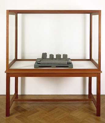
Entwurf fĂ¼r ein FilzenvironmentModel for a Felt Environment


The Sculpture (pictured above), Model for a Felt Environment, has neat rolls of grey felt sitting on painted wood inside a vitrine, as suggest by the title is intended as a model for an ‘environment’.

Vitrines are normally used as display cases commonly found in museums to present objects which are significant for example because of their value or historical influence. Beuys use of common object in this scenario allows the audience to question their signification from when Beuys can answer philosophically.


Beuys, Josef
felt suit

The sculpture is a stitched brown suit (jacket and trousers) lengthen at the arms and legs, made from felt, suspended from a wooden hanger. It is a replica of a suit Beuys wore to an anti-Vietnam event in 1971 conducted by the group Fluxus, which Beuys was a passionate member.

The suit can be seen as an icon of safety and a medium of shelter. A suit in reality can give humans physical warmth in a practical sense. However Beuys goes on to explain this as: ‘Not even physical warmth is meant... Actually I meant a completely different kind of warmth, namely spiritual or evolutionary warmth or the beginning of an evolution’ Therefore using the art as a social sculpture, a medium for social and political converse.

He wore to suit in order to keep warm during his protest against war, an obviously devastating life taken affair. On that day in 1971 the suit was more then warm protective clothing for Beuys; if the protest was successful, it is a symbol of life and protection for the civilians that would have entered battle I Vietnam.

Beuys choice or action to reproduce the suit and promote a common place object as art is an exciting, energetic, medium as the new meaning becomes powerful.

There are connotations of the suits worn by prisoners, in particular those in Nazi concentration camps. This imprisonment link can then acts as a symbol of the isolation of human beings. Although isolated, I like the idea: the prisoners although striped bare of so much, physically and emotionally, they still have or have been given this suits to keep them warm. And Beuys promotion against war may give them hope, for those wrongly imprisoned, that justice is still being fort for. A though they can be reminded of every time they feel the snugness of the suit.

He worked with felt because he believed them to be of universal relevance to the human struggle for survival. Felt itself is both insulating, protective within it’s properties making it an ideal choice to suit the overall themes. Below are two more examples of Beuys work to show the relevance of using felt as a material:


Beuys, Josef

Plight

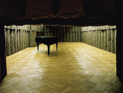
Felt rolls comprise to produce the work ‘Plight’ meaning environment. The walls and ceiling are covered completely with the rolls to create a stifling atmosphere.

Beuys, Josef
The Chief

Beuys produced a performance or an ‘action’ when reffering to his Social Sculpture concepts, called ‘The Chief’. The artist was wrapped in a felt blanket, during the nine hour performance he has to fighting claustrophobia by lying practically still, as if in a coffin.

The use of felt is important because, as a material, its properties mean it can both insulates and absorbs. This allows the artist to represent both protection and a sense of constriction or almost suffocation.

It is believed a childhood interest in the natural sciences gave Beuys his desire to explore and experiment with the properties of materials. As well as felt he regularly worked with animal fat copper and wax believing them to be of universal relevance to the human struggle for survival because they can be seen as proposing: insulating, conductive, protective, transmitting and transforming properties.

Saturday, 1 January 2011

Designer Analysis - Vasarely, Victor

Vasarely, Victor
Pal-Ket
Victor Vasarely was a Hungarian, French artist born in 1906. His work is considered an early example of the Op Art movement. Optical illusions are abstract images. The interactions between the pictures plains are manipulated to create the illusions. the viewer is entertained by their understanding and what they are actually seeing. Illusions include movement, flashing, swelling, warping, hidden images and patterns. Mainly in black and white, but later artist progressed with colour.

It is our own vision and human ability to see that makes exploring techniques within this movement so interesting, the retina for example records colour input differently as it receives the different light inputs. Manipulating this can create an interesting study.
In the Painting Pal-Ket Vasarely demonstrates beautifully how using optical art techniques can create an illusion of a sphere appearing to bulge from a flat surface. The image consists of a chessboard style of a square grid which is manipulated according to the movement. In the centre of the page, the central four squares have been enlarged, acting as if they are closer to the audience. From the center the grid then takes 8 different proportionate directions until it reaches the edge of the sphere boundary line. From there the grid almost melts back into the proportionate, flat, chessboard.
The fundamental achievement of the ambiguous image and the audiences perception is the measurement of the grid. Between the center, as the grid declines, towards the corners in an affair of cubic growth until it has reached it's original size from there it reduces in a linear manner until it either falls from perspective or rejoins the flat background.
Colour has been included to add depth to the illusion. Purples, blues, greens, white and black sits to fill each of the geometric shapes. Black and white forms the background in sence that where either is dominate it affects it's combination with the primary pigments. White is found around the edge of the sphere acting as a light source or reflection. Black then makes home in the centre and on the outskirts of te image. Colour is divided in the four: top left is green with a purpal background; top right blue with a green background; bottom left blue with a black background; bottom right purpel with a blue background. Like with the grid measurements as the colours change saturation changes with a tinted or shaded effect it results in an illusion of change.
Each box contains a circle which gives the surface a pattern. This emphasises the movement of the grid and has the potential to clarify the direction of the movement.

Designer Analysis - Pollock, Jackson

Pollock, Jackson
Number 1A, 1948

Paul Jackson Pollock was born in 1912, an American painter, he became a major figure in the Abstract Expressionist movement. The movement was developed by American painters, mainly in New York, in the 1940s and 50s. The name suggests a rebellious, disordered, and lawless craze, a feeling you would expect from a post-war community. The focus of the art involved producing or expressing an emotional effect. Like surrealist concepts, expressionist felt art should come from the unconscious mind. There was two broad groups within the concept: action or colour-field. Action painters were spontaneously, improvising as they went along in an automatic, subconscious manner. The Colour-Field painters instead had interests in religion and myth, using simple compositions of colour in blocks in an attempt to engage the viewer as well as provoking a meditation response from the viewer, thoughtful and reflective.

Number 1A, 1948, created by Pollock is a large canvas smeared with paint, from drippings of paint in large dramatic brush strokes and sweeping marks. To do this he would pour and fling the paint, using sticks and knives. A childish action that is hard to control. This technique was enhanced by the scale, which requires a large input of an energetic application which would be hard for someone of inferior strength. it is this exertion that gives the finished effect it's energy, a buzz, an electricity of power that sits almost off the canvas. I feel if the initial input had been less aggressive the finish wouldn't be so kinetic. He also had to pouring paint direct from the can or trailing it from the brush or a stick to directly placed their inner impulses on the canvas.

He worked on the canvas either on the floor or tacked to a hard wall in order to freely move around it's edges. Removing the easel gave him freedom and changes the idea of a traditional perspective. It is this freedom of expression that was so relieving for the artists having been controlled for so long by war censorship.

Each stroke is individual, it can not be repeated or copied, and the nature of the painting means there is no mistakes. The page is infinite in respect of there being no beginning or end, instead a seemed endless overlaying of beauty.

Within the picture you can see -in order of the dominance- the following colours : pure black citric pale green turquoise, florescent highlighter orange, bleached white, melon red, deep dry blood red, and a chocolate brown. This eclectic mix sits on top of the background colour of a light antique brown that holds reference to an old piece of paper.

Designer Analysis - Rauschenberg, Robert

Rauschenberg, Robert
Reservoir
Robert Rauschenberg was an American artist born in 1925. His work was popular in the 1950s when he made the transition to Pop Art. He is known for combining non-traditional materials and objects to make innovative combinations
The Pop Art movement draws from sources in popular and commercial culture, such as movies, advertising, packaging, pop music and comic books, to form the perspective of fine art. Often using objects to represent the subject then engage with an combine to produce contemplations. but the subject itself isn't about the techniques it is about the attitude of challenging tradition. It is one of the first examples of postmodernism. Often the artists used low subject matter and treated it uncritically. New modern topic matters or themes were explored.
In the painting, Reservoir (pictured above),Rauschenberg has used common placed objects over a splattered background. The main objects are the two clocks placed near the top and the bottom left corners. They read two different hours which suggests movement. The higher shows the time Rauschenberg started the painting, and bottom when it was completed. If you conclude that the time did not run over a period of days it can be assumed that it took only an hour and five minutes. Time is a nice niggle for art critics, who could suggest that great art must have labour hours invested into it to make it valuable. I feel that this is a small stand promoting post-modern art.
A number of materials have been used to form the image: oil, wood, graphite, fabric, metal, and rubber, as well as the additional rounded objects. Putting 'Fat over Lean' as it can be described produces new lustful textures and effects. When playing with materials you often get a unique desirable results that produce questions for the viewer. Rauschenberg using objects instead of paint works as a Pop art idealisim and fills the gap between art and life. It breaks away from traditional picture space as the objects extend away from the canvas.
The painting technique are erratic. Bold thick strokes have been used to rush around the painting. There are drip marks. No efforts have been made to integrate the bold colour patches. the edges of the colouring are jagged as each brush stroke finishes in a different place. All theses factors collate to an exciting energy of hast and add quality to the theme of movement.
The colour and main compositional additions are at the top of the page, bellow a dirty level white subsides, with the clock leveled upon a bold red splatter. The centre is covered in a textured brown and consists from objects and the paint. It flows to the left into a black with navy highlights the settle a base for the higher clock. Above this floats a purple and white mixture. All colours mentioned are clumped separately with whiter versions of the strongest hue pasted within. In the remaining top area above the mentioned arc is a more pastel collection including a blue and a peachy red clump. Primary colours with no secondary colours to assist an analogous ease. the top right edge trails into a weak soft brown created from the red cluster.
It is unclear what subject, objects or scene the artist was painting, or if there was indeed a objective at all, but as an onlooker I feel there is a collection because of the strong colour divides. The wood placed above the clock confirms this and gives the image structure as a beam would within a house. The arc of browns and black holds the foreground and the pastel colours rest as background.

Friday, 31 December 2010

Designer Analysis - Jones, Allen


Jones, Allen
Man Woman, 'Hermaphrodite' series

Allen Jones a British Sculpture born in 1937. His worked revolved around the Jungian psychology and the philosophy of Nietzche. He focused on the creation of art and the ability to integrate male and female elements. His work can be seen as part of the British Pop Art movement which started in the mid 1950s and peaked in the 1960s.


The Pop Art movement draws from sources in popular and commercial culture, such as movies, advertising, packaging, pop music and comic books, to form the perspective of fine art. Often using objects to represent the subject then engage with an combine to produce contemplations. but the subject itself isn't about the techniques it is about the attitude of challenging tradition. It is one of the first examples of postmodernism. Often the artists used low subject matter and treated it uncritically. Jones exploring the topic of hermaphrodites in this manner is an example of how new subject matter can be developed in new ways when presenting art.


Jones's Man Woman painting from his 'Hermaphrodite' series is a self portrait, the mans body is Jones and he is connected to an unknown woman, The word Hermaphrodite can mean male and female bodies melting into each other. Jones is portraying the unity of a sexual act.


Within the picture there is a representation of a male and female then body connected as if he has his arm around her as they are sitting down, an innocent act of affection.


The bodies do not have heads, which takes away most of their identity emphasising there choice of clothing to discover any characteristics. The man is wearing a typical everyday brown suit worn by most of the British office users in 1960 when they head. She appears less professional but very femine, a v-cut neck forms part of her dress or skirt arrangement; it appears ruffled, designed, colourful and exciting. In the scene it has been hitched up to reveal the whole of her right leg: tights, suggested stockings and heels. If I was to read into the story told by the painting and make my own subjective assumptions I would guess that this was an office love story of lust, affection and betrayal as the employee has an affair with the sectary.


Block colour has been used to create the image; appearing almost cut out. A mixture of about ten pastels. On her evenly distributed to make up her dress: a brown dirty and a lighter sunnier shade of yellow, two soft lake greens and a sky blue. Then an almost violet blue for her covered leg, and for the reveled, a fresh, skin, peach and a soft, deep, velvet, purple for her thigh. On him less colour is used: a pinkie, peachy chest, then a brown trouser and shirt, and a dirtier, darker brown for his jacket. His tie however is thinly striped and echos colours from her dress. she is sitting on a navy seat and he is perched on her which is emphasised but the gap between his legs and body where there is nothing. Although cutout, the colours disperse slightly at the edges and there is occasional blurring.


Designer Analysis - Hayter, Stanley William

Hayter, Stanley William
Claduegne
Stanley William Hayter was a British Painter and printmaker born in London in 1901, who set up the Atelier17 studio. His work in the 1930 was associated with the Surrealist movement, launched in Paris in 1924. The aim of surrealism was to reveal the unconscious and translate it into art. There was no single style of Surrealist art but two broad types can be assumed: (i) oneiric (dream-like) (ii) automatism. The work features the element of surprise, juxtapositions and the unexpected. He then developed his work and became renown as an innovator of printmaking and engraving.
The picture above shows one of Hayters Prints, Claduegne. The picture is of a collection of ribbon like bands that form a grid structure. The grid isn't flat, the ribbons run at an angle facing down from the bottom left to almost the top right. but instead finish in the top corner with a sleep incline. Each line appears interwoven at a 45 0 angle. It isn't rigid, although I have described the page as a grid, the ribbons appear to flow across the page making slight wave like curving movements from left to right.
More interesting then the form is how it relates to the colours. Fluorescent, sharp almost electric seems to be the theme for the colour pallet. Four colours are primary. the background a carpeted deep purple with a vertical lines of a very faded turquoise. As the ribbons descend this purple is covered with a soft red that appears as a light rather then a colour. areas have been scraped away or worn and parts of the carpet is reveled. The ribbons on this surface are the same electric turquoise blue that runs through the purple. As they twist or overlap the colour is removed to produce a checked pattern. The ribbons running upright look to have a colour descended from the red, they are a fluorescent pink and produce the same transparent pattern as they cross another subject. All the colours are acidic.
On a whole there is a grubby, uncleaned sanded texture as if the colours have been overlapped in the wrong order and had to undergo a peeling procedure to readjust the image; parts therefore worn off or stuck in the process.
There is no beginning or end to the study, it looks instead as if it is a snapshot of a larger sample study.

Designer Analysis - Gabo, Naum


Gabo, Naum
Linear Construction in Space No. 2


Naum Gabo was a sculpture born in Russia in 1890 he then moved in 1922 spent time in Berlin and Paris before becoming an American Citizen. His work is seen as part of the Constructivist movement because he can capture the idear of the infinite expansion of space. Constructivism originated in Russia from 1919 until around 1934, artist and architects rejected the idea of "art for art's sake" instead used art as a practice directed towards social purposes.

Gabo's Sculpture Linear Construction in Space No.2 is made using a curved perspex frame and nylon string. There are four Perspex arms joined at the bottom in a small stand, connected to the table surface to keep it stable. Each arm goes in a different compass direction but upright so they connect directly above the original standing position. Within this stretched oblong frame there is a reduced version floating. There appears also to be a central pole. this structural set up make the sculpture look as if it's floating or balancing in it's upright position as if an invisible cord is it's secret.

Looking at the picture (above) it gives a clear perspective of looking directly at one of the 4 arms. parallel you can see it's east and west counterparts. The Nylon string is wrapped around every edge of the arms and then directs towards the central cadge, where it is redirected towards another edge. Twisting, turning almost fighting the other cords to get there, the strings forms beautiful concave and convex folds. None of the cords are overlapped or tangled, they are all tight, aligned and organised.


The materials used are clear, thin, and light so the overall structure has a delicate, transparent finish which appears almost weightless. There is no beginning or end to the sculpture, and because of the extent or number of cords used you cannot unconsciously tract or follow it's direction. It appears infinite.

Thursday, 30 December 2010

Designer Analysis - Christo Javacheff

Christo Javacheff
The Pont Neuf, Paris

Christo Javacheff was born in 1935 in Bulgeria. He is famous for his works he often did with list late wife Jeanne-Claude Christo where they would wrap up structures and landscapes on a large scale using materials and rope. The work can be described as similar to the work of New realists (Nouveaux Réalistes) a French movement founded in 1960 by Pierre Restany. The movement is famously described as new ways of perceiving the real. and is closely associated with the European Pop art movement. Artists use collage and assemblage or real objects in their work. this incorporation allows the artist to see the world as an image, from which they would then take objects from or as Christo does take his work to a real life subject both situation allow the artists to bring art and life closer together.

The above photograph shows a sculpture piece created 1985 and left for two weeks before it was dismantled. Christo wrapped up- The Pont Neuf - Paris's oldest bridge, in a thick canvas and secured it with rope. This was considered an exciting new way to create a sculpture.
The odd temporary engagement allows the viewer to be drawn in to the sculptural details of the bridge and engage with the new surface.

The work can be considered as holding a theme of preserving and restoration. The only other time you may see something covered in a similar textile would be if restoration work was taking place. Christo work may spark this association. Or similarly the beauty captured by his work argues reason for the preservation of the historical structure. The attention also creates a refreshed media hype to something sceptical but maybe forgotten because of it's historical construction date, reviving the original beauty.

Designer Analysis - Moholy-Nagy Laszlo

Moholy-Nagy Laszlo
CHX
Laszlo Moholy-Nagy was a Jewish-Hungarian painter between 1895 and 1946. He worked as a lecturer in the Bauhaus school. His work is considered as part of the Constructivism movement. Constructivism originated in Russia from 1919 until around 1934, artist and architects rejected the idea of "art for art's sake" instead used art as a practice directed towards social purposes.

In CHX Laszlo has drawn four shapes and then surrounded them within the space using four geometric lined grids. This gives the illusion of them being suspended within the space. The environment appears infinite.
The main shape comprises two Z shaped bubbles connected by a rectangular textured box the top Z is misshaped to appear reaching upwards. The other three shapes can be described as rectangles warped into position and the corners rounded, they sit in three different corners of the page.

The grids do not follow the same horizons; each one is adjusted according to its shapes direction. As you focus on each different shape, I find you naturally twist your head so can view it on its natural plain. This I feel is the main contributor to the shapes appearing within their own space.
Only the three primary colours have been used, however their strength is altered. The most prominent is the red that almost surrounds the main shape. At first sight I would describe it as a bleeding texture. Prominent in the centre and them equally diffusing at the edges in a splutter of fragmented but soft droplets. As it spreads to wards two of the other shapes it curls around their edges as if affected by them.

The red also combines with white to make the streaky pattern within the main shapes box. Pictured like a zebra stripe or a scientific magnified image of a voluntary muscle found in human biology books. The pattern doesn't fit with the overall themes of constructivism, adding form to the almost scientific study.

The bottom Z is coloured yellow with the red blotching its bottom corner. The top Z is coloured white with a deep navy blue lining the top right side diffusing across to the white side. Blue is also found with top right box contained within a curved block.

I think the most influential colouring within the image is the yellow surrounded by the larger red. This creating a Simultaneous contrast effect and propels the yellow shape away from the page to create an illusion of its direction. This is them emphasised by the misshaped top Z the top corner which is misshaped and highlighted blue which gives the illusion of it propelling upwards.

Overall the image is a brilliant example of a successful study into the form and colour can be simplified to explore space and volume.

Designer Analysis - Riley Bridget

Riley, Bridget
Cataract 3
Bridget Riley is a painter from London who work was recognised since the mid 1960's. Her work has been associated with the Op Art movement. Optical illusions are abstract images. The interactions between the pictures plains are manipulated to create the illusions. The viewer is entertained by their understanding and what they are actually seeing. Illusions include movement, flashing, swelling, warping, hidden images and patterns. Mainly in black and white, Riley is on of the front artist who progressed with colour.
It is our own vision and human ability to see that makes exploring techniques within this movement so interesting, the retina for example records colour input differently as it receives the different light inputs. Manipulating this can create an interesting study.

In Cataract 3 waves horizontally drawn across the page by combining a wide arc with a very steep front to create hills sliding down the page in a south east direction. A uniform sequence with no mistakes.

Initially a black and white colour pallet is apparent that alternates between each block of wave. However within the image there is a red tinge diffused vertically and subtly across the eye line. The back turns more to a grey, then both initial colours make room for a new red line that echoes exactly the same movement. The intensity of the red changes, I think it has been mixed slightly with a black to change it's darkness as it gets closer to the top and bottom of the eye line. Resulting in an assimilation contrast.

Initially the images may remind the current generation of a faulty computer inject printout where the ink is low that gives red colour interruptions.

The artist has limited herself to a few elements a basic lines and a pattern. She therefore arguably has to be creative to produce a painting.

----------------------------------------------------------------------------------------

Colour interaction
(i) Simultaneous contrast
When one area of colour is surrounded by another area of a different colour. Initially it enhances the difference in brightness and/or colour. Also if the surround area is larger or more intense than the area it encloses, then the contrast is out of balance, resulting in exerting one of the colours.
(ii) In successive contrast.
One colour is viewed and then another, achieved by shifting fixation from one colour to another.
(iii) Assimilation contrast
The lightness of white or the darkness of black may seem to spread into neighbouring regions. Similarly, colours may appear to spread into or become assimilated into neighbouring areas. Resulting in neighbouring areas appear more alike

Designer analysis - Schiele Egon

Schiel, Egon
Seated Woman with Bent Knee
Egon Schiele was an Austrian painter during the early 19th century. His work has been associated as part of the expressionism movement that originated in German at the start of the 20th century. The ideals of expressionism are to present a subjective perspective, distorting a subject for emotional effect, promoting a response and ignoring the physical reality. I think this movement description is important in analysing this piece of his works.
The painting is a portrait of a young and beautiful woman, as titled; she is seated in an informal position with her knee bent on the ground. Her head resting upon it as she loosely curls her arms around her leg. The other leg opens out her body position exposing herself. This accompanied with the head facing towards the artist expands the woman's body language and allows the viewer to feel engaged with the subject.
Many of her features suggest personality traits of a vibrant, adventurous, unafraid, and mischievous person; distinctively her short, thick, uncontrollable, bouncy, albany curls.
Her facial expression is serious but also flirty. The raised eyebrows and pouting lips contribute to the erotic salutations but it is the gaze that is most exciting, I feel as if her wide eyes are almost asking a question and demanding the answer. This gaze could feels almost threatening.
The body proportions aren't exact. the neck is elongated and her legs and hips look larger then a normal perspective, this allows her body to sit comfortably in the lounged position.
The pallet is purposely limited in the painting upon the white background. The colour is focused on the orange albany hair, the turquoise green sleeveless top and black leggings. The rest of the image is comprised of her pale cream skin, muffled white shorts and unpainted shoes. The only other colour focus point is her red lips.
Upon the bright colours of her hair, top and leggings, the brush strokes are exaggerated almost scraped onto the canvas creating dense, long, thick irrigated lines.
The softer parts of the painting have mainly, unnoticeable brush marks. Her skin has instead a blotchy texture of occasional browns and albans creating blemishes, dirt marks or shading, giving an unwashed finished. The shorts look almost unpainted the outlines are a strong array or thin lines and the fill is merely a white speckle.
The two colour differences create a balance between the positive and negative spaces in the image. if the figure had been entirely finished it would not seat into the background comfortably.