BA (Hons) TEXTILE DESIGN
STAGE 1
AUTUMN TERM: 2010/2011
Project: POPUP
UNIT 2: Concept & Process
Date:18th October -10th December
40 credits
POPUP
Popup spaces are a new, exciting and sometimes anarchic way of transforming disused space.
Do-it yourself culture is taking over
Shops, galleries, restaurants, cinemas appearing in empty and unloved spaces.
Your desk is your space
Create a dramatic, visually exciting Popup collection of objects that interconnect in a variety of ways to illuminate some aspect of your contemporary experience. We are asking you to create Two POPUPS. Popup1 will inform your first two technical blocks (Autumn term) and Popup2 will inform the remaining two technical blocks Spring term (see timetables on blackboard).
Consider representing a Place or a Sequence
POPUP PLACE
For example - Popup Peckham popup fridge /garden shed.
Objects which describe a particular environment which you may have an interest in or a personal connection to ,scale and breadth of space are an important consideration – could be an investigation of a very tiny world in microscopic detail, from a patch of ground to street level to locality to universe
POPUP SEQUENCE
Connections between objects, storytelling, back stories, free association, family histories,
reflecting on an experience. Objects relating to an issue you are really concerned about. A political issue. A Joke. A secret. Something mysterious. A juxtaposition of unlikely elements. a sequence…a transformation, a metamorphosis. Synecdoche (where the part stands in for the whole or the whole for the part).
The POPUP, although a piece of work in its own right, is also an image bank for future development; a source of inspiration for you to draw on in the coming weeks. It will also act as a starting point for the work you will make in the forthcoming technical workshops. We are asking you to respond to your collection developing your own visual language, responding to colour, contrast , juxtapositions, narratives, texture, form, mood.
PROGRAMME OF STUDY
18th October – Assemble your Popup on your desk consider your arrangement carefully to convey your particular story or mood.Independent Study & Taught Sessions
The next two weeks in the studio will be spent recording through drawing, cataloguing, painting constructing, inventing, wrapping, photography. This will include independent study and taught sessions. You will be introduced to a variety of approaches to drawing in day workshops run by specific tutors.
TUTORIALS
Monday 25h October - One to One Tutorial
You will be assigned a Personal Tutor and have one tutorial to discuss your progress and any issues.
Thursday 9th December – One to One Tutorial on progress
Monday 21st February – Unit feedback tutorials – one to oneUNIT ASSESSMENT DEADLINE – Monday 14th February – display your work in your studio space by 10am DG17. You will then use this day as an independent study day whilst tutors assess your work in the studio. No access to studios on this day after 10am.
Learning Outcomes – In order to pass the unit you are expected to:
1. demonstrate knowledge of the key principles of textile design and design processes.
2. present, evaluate and interpret information through your practical visual research, and use this to develop design work that is translated into your samples.
3. evaluate the appropriateness of processes, skills and methods of textile design in order to explore your ideas through knitted, woven, stitched, printed and digital samples.
4. use self-reflection and critical evaluation as part of the learning process.
5. communicate your ideas and findings using structured and coherent arguments. Present samples professionally appropriately to textile design.
6. demonstrate transferable skills and qualities such as initiative and problem solving
The learning outcomes will be assessed through the marking criteria listed in below.
Marking criteria
- Research : Systematic identification and investigation of a range of academic and cultural sources
- Analysis : Examination and interpretation of resources
Subject Knowledge : Understanding and application of subject knowledge and underlying principles - Experimentation: Problem solving, risk taking, experimentation and testing of ideas and materials in the realisation of concepts
- Technical Competence : Skills to enable the execution of ideas appropriate to the medium
- Communication and Presentation : Clarity of purpose; skills in the selected media; awareness and adoption of appropriate conventions; sensitivity to the needs of diverse audiences
- Personal and Professional Development : Management of learning through reflection, planning, self direction, subject engagement & commitment
- Collaborative and/or Independent Professional Working : Demonstration of suitable behaviour for working in a professional context alone, or in diverse teams
Pages 59 and 60 of the Course Handbook 2009/10 (available on Blackboard) explain in detail the levels of achievement indicators for each of the marking criteria.
Assessment evidence
• Evidence of design research and development.
• Presentation of a collection of design work reflecting specific themes related to the project.
• Fabric samples for each textile technical block.
• Technical notebook
• Presentation of research material related to study tasks for theory.
Self-evaluation form

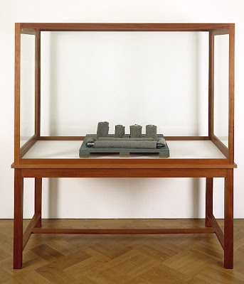
 Precision.
 Box covered then cut
 Material base layer


 The Foundling museum


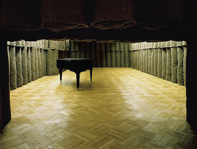 Beuys, Josef
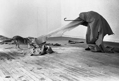


